


Once upon a time…a Pocket Prep Story
Pocket Prep has a particular challenge in engaging our users: We’re a study tool for over 100 niche professional certification exams, and people typically don’t love to study.
These exams are difficult, require an incredible investment of time, and hundreds, if not thousands, of dollars to surmount. Our apps are a supplementary study tool to reinforce what users have learned in their textbooks, classes, and workshops.
Pocket Prep, like many start ups, outsourced its design and development for years as it built a user base. However, over the past 3 years, we’ve been growing a small but mighty product team with four developers and two designers (including myself) to craft our study products. In the summer of 2020, we set out to redesign our outdated web platform, originally designed and developed by an agency, to elevate our UI and give our users a more efficient and enjoyable studying experience.
I hope this review of our process – what we did, what went well, lessons learned – will inform other small product teams embarking on their own legacy projects. Legacy redesigns can be overwhelming, but they are an opportunity to elevate the user experience and success of a company. Let’s get into it.
Case Study Outline:
Where we started
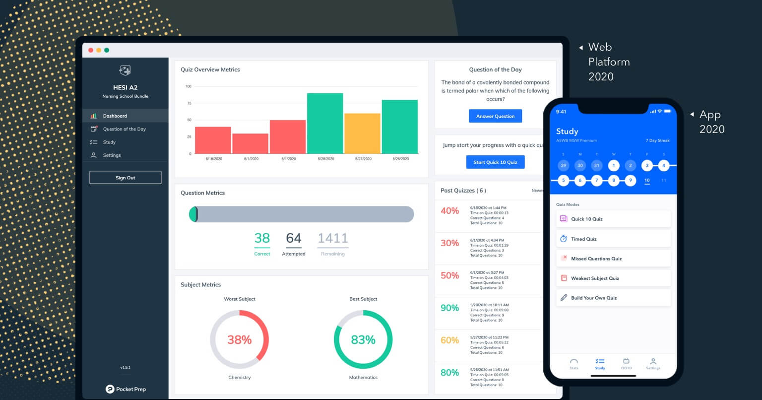
About 75% of our 200,000+ monthly active users studied with our mobile iOS and Android apps in 2020. The remaining portion used our legacy web platform, a remnant of outsourced agency design and development from 2017. It was outdated, lacked our recent feature additions, and was minimally maintained.
Legacy redesigns are a common challenge for any product-driven company; it can be a daunting effort to refine a motley collection of features cobbled together over years of disjointed decisions. It’s important to maintain expected user behavior vs. improving workflows. It’s also a chance to incorporate the product into the larger visual design system it inhabits.
Our design team often acts as a facilitator for collaboration and company alignment on Pocket Prep’s product initiatives. Redesigning our web app was our UX team’s first chance to demonstrate the value of a full design process: thoughtful, thorough, and user-driven.
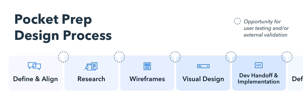
The first step of our design process brought the team together to define and align on goals.
Define and align
A common (and inadequate) reason to redesign a legacy product is to make it look better.
A redesign is a massive investment in resources. Our product team needed goals driving our work in order to be successful beyond aesthetics.
Key stakeholders – CEO, CTO, Engineering, Design – sat down in our Define and Align meeting to evaluate why we should redesign our web platform in the first place. Facilitated through a sticky note session in Whimsical, everyone had the chance to share their hopes and concerns with the web product as it existed and important elements to consider as we rebuilt.
An all-hands kickoff meeting, while important for the success of the project, also lent itself to the kind of culture our UX Lead and I wanted to cultivate as key values in our young product team. Aligning on our goals and expectations early gave our team a shared idea of success to work towards and set the tone for a collaborative project.
Through our discussion, we distilled two overarching goals:
Elevate our web platform to match our mobile app’s features.
Not only were our web users getting a sub par experience, but we were making our work harder. On the product side, we had to design and code for two systems or choose to further the gap between our platforms. Our marketing team faced a challenge in communicating feature announcements that were only relevant for a portion of our users. Every item had an asterisk for *only mobile apps. This created a disjointed experience for our users and made our marketing team’s job more difficult.
Enhance web features to take advantage of the screen real estate a desktop format offers.
Initial user behavior data showed that our web users preferred a desktop format for long study sessions. We wanted to advance our desktop experience to account for this preference.
Research
In a crunched design process, competitor and user research is often the first phase to get scrapped in favor of “speed” and “efficiency”. This is a huge mistake. It typically results in poor design and incredibly expensive rework.
Research allows us to get an understanding of the competitive landscape, compare our goals with trends in the industry, and—most importantly—gather data on what our users care about most.
As an in-house team, it’s easy to feel like we know our users. We wanted to check our own assumptions and understand the details of who our users were, what their study habits entailed, and how they used Pocket Prep. To do that, we sent a survey to our web platform users and gathered user behavior data in-product.
Survey
Our goals for the survey were to understand:
- Why our users chose Pocket Prep
- What they found useful about the web platform
- What they would improve about our product
- Basic statistics around their study habits
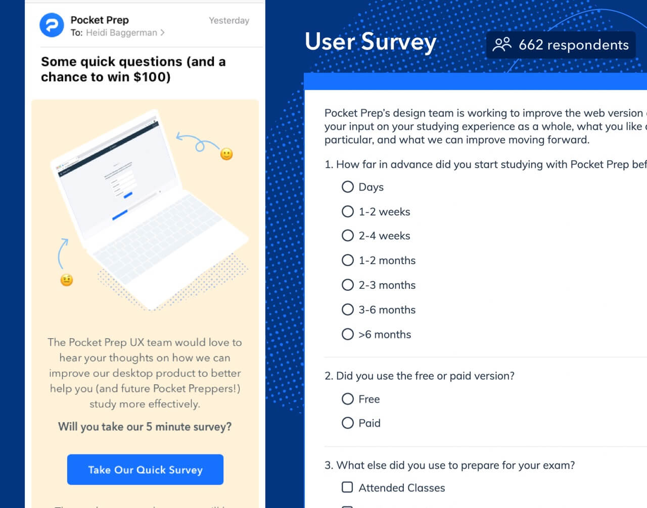
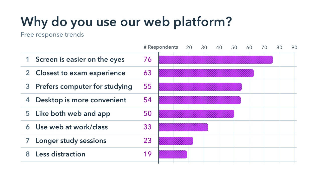
Over 650 users submitted responses. Most of our survey questions were open ended, which made parsing through the data manually a pain, but it meant that common themes were born of authentic free response feedback.
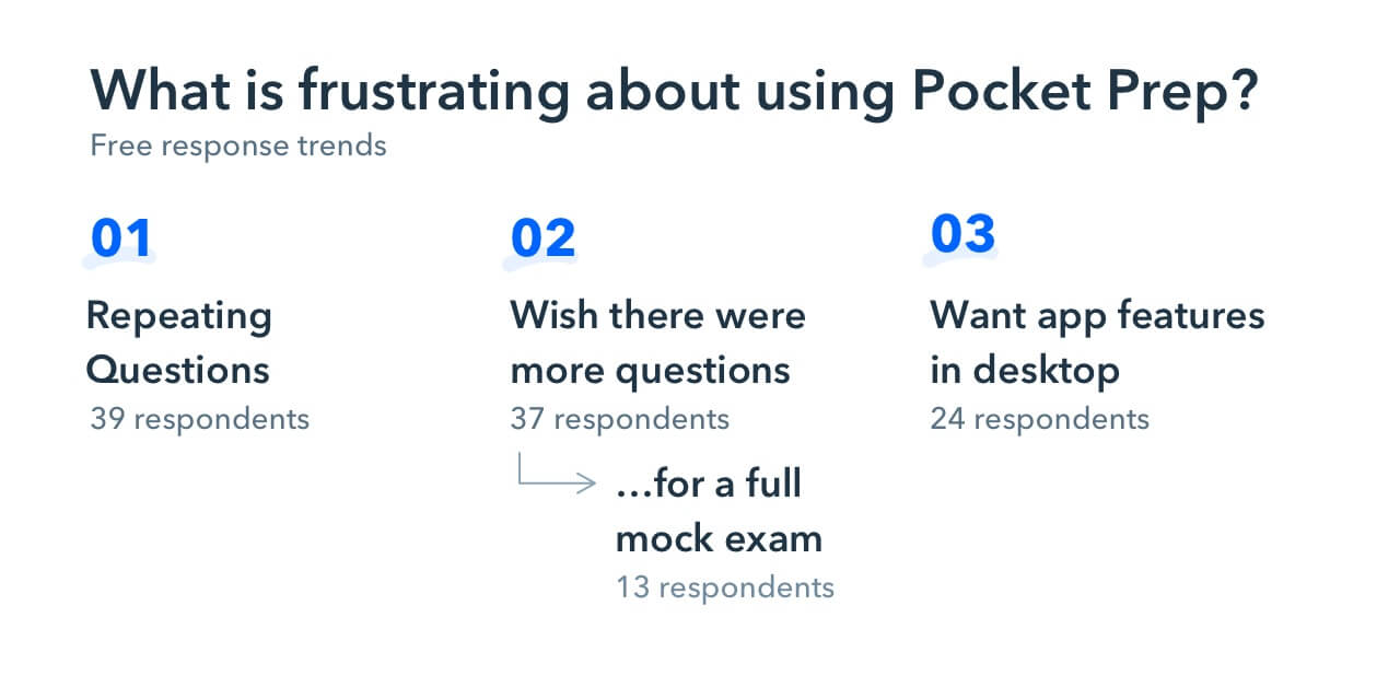
Common themes were:
- Requests for a Full Practice Exam to imitate the real exam experience
- Strong explanations that accompanied our quiz questions were a strong selling point for users
- Appreciation for performance statistics by exam subject
- Appetite for customizability around quiz controls
- A craving for community and encouragement to get them through the anxiety of studying for such intensive exams
- Love for the on-the-go nature of our app to fit in regular small study sessions
While a survey is a great way to collect large scale self-reported user data, it’s also important to pay attention to user behavior where possible.
User Behavior
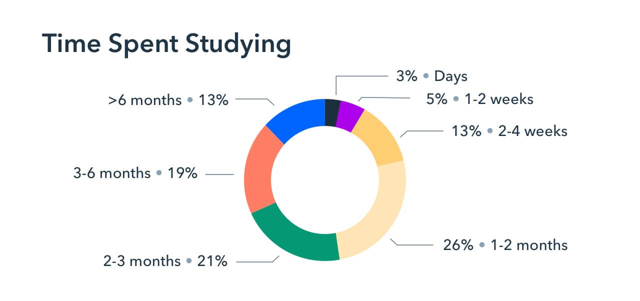
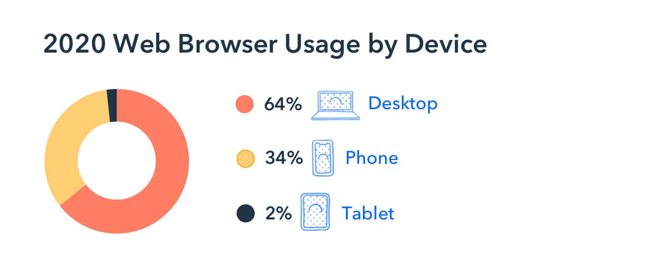
We pulled device usage data from our web platform and found, top level, that 64% of our users were on desktop, 2% on tablet, and 34% on mobile. We also found that our web users’ average session length was twice as long as mobile app users, which aligned with survey feedback that desktop was preferred for longer, more focused study sessions.
We reconvened as a team to discuss these findings and consolidated several additional feature concepts based on community feedback to move forward with.
Wireframes and user testing
From this foundation of user data, I utilized Whimsical to build out the basic information architecture and user flows. From there, I wireframed core functionality of existing features in the mobile app and potential features we identified through our initial user research and internal team discussions.
The rough nature of wireframes enables stakeholders to focus on the functionality rather than the sexy visuals and respond with a level of fidelity appropriate to the design. We could iterate through good and bad ideas quickly without feeling a need to achieve pixel perfection.
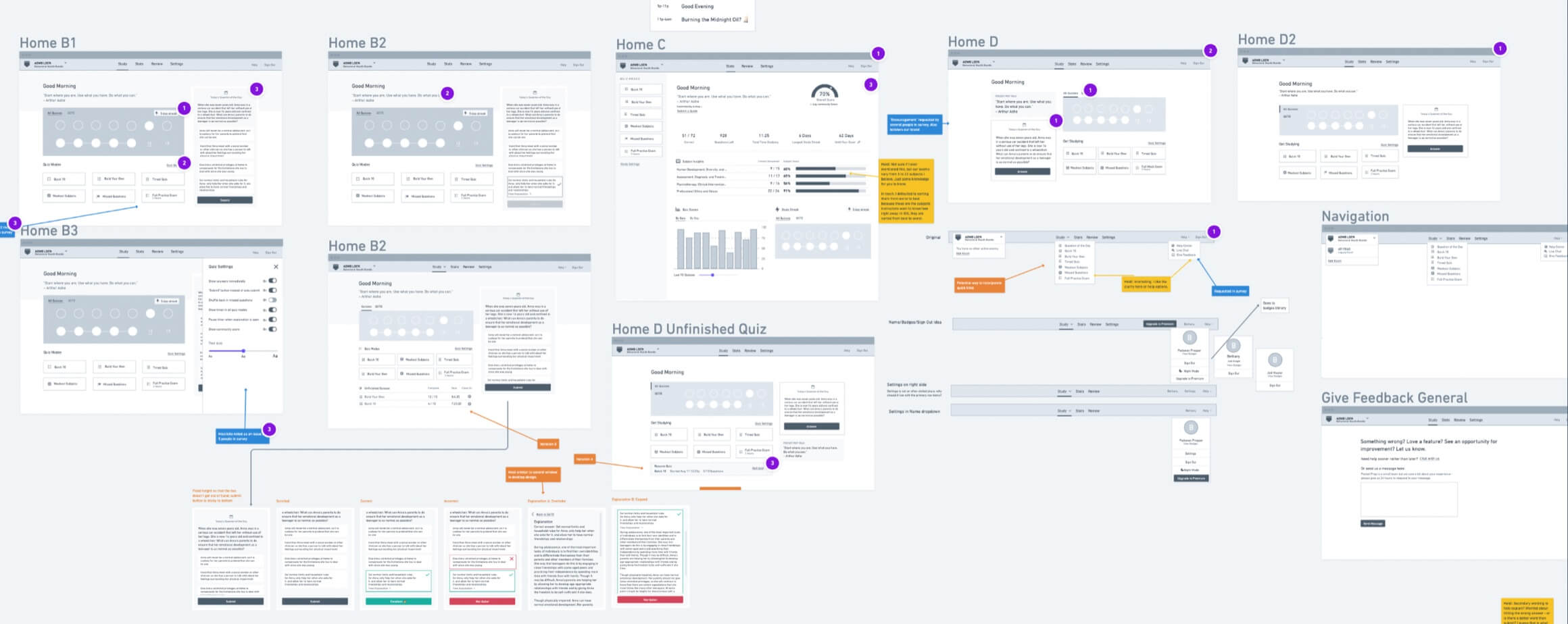
Wireframing key layouts and workflows allowed us to consider:
- How might this work?
- How might the layout roughly look?
- What legacy concepts might be enhanced?
- Is a new concept technically feasible?
- What are some promising ideas we can evaluate in user testing?
After a round of clarifying edits with stakeholders, we arrived at a good point to verify functionality and potential feature value through focused user testing.
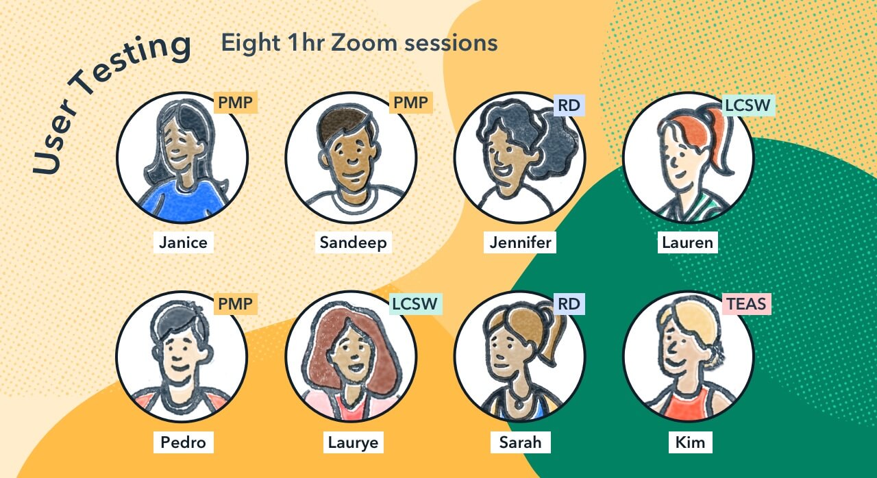
I pulled 10 strong responses from the customer survey and reached out for 1:1 interviews to test wireframe prototypes (with an Amazon gift card as compensation).
I conducted eight one-hour Zoom user tests with Pocket Prep users over the course of two weeks. We tested onboarding flows, discussed the value of specific feature ideas, and tracked how users interacted with several of our wireframed prototype flows.
A side note on the value of user testing:
If you or your team questions the value of user testing, ours cost $800 and about three weeks of my time to prepare, conduct, and process feedback into a presentation. It breathed life into the work we were doing and personally gave me energy in this long process. It was a reminder that everyone from college students to advanced professionals use our app to prepare for what is an important and weighty step in their careers. It was humbling and inspiring to talk 1:1 about their journeys and how they used Pocket Prep to move forward in their goals.
From our testing, we found that users valued the following features most:
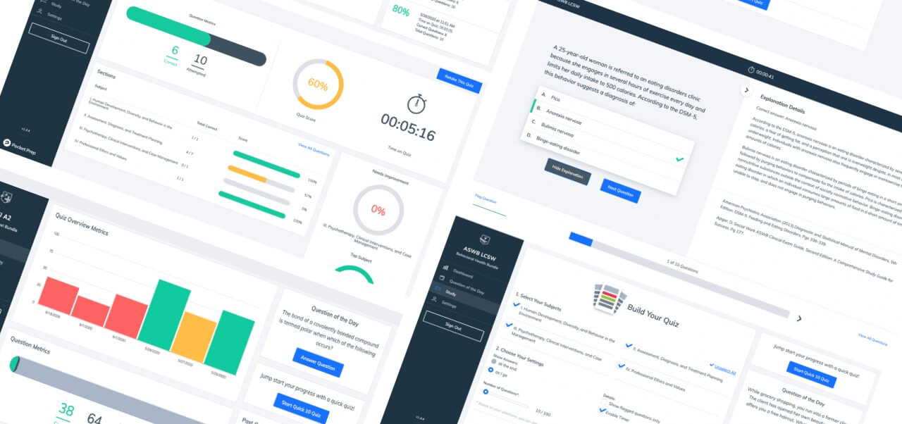
- Full Practice Exam a mock exam unique to their chosen certification exam that would imitate the experience of the real exam — includes precise number of questions, a pre-established time limit, etc.
- Review Tab a place to search, filter, and re-study questions they already answered
- Notes feature a way to highlight specific content and save it into a separate Notes section in the platform
Finally, we tested three navigation layout options to gather data on how best to organize our core tabs.
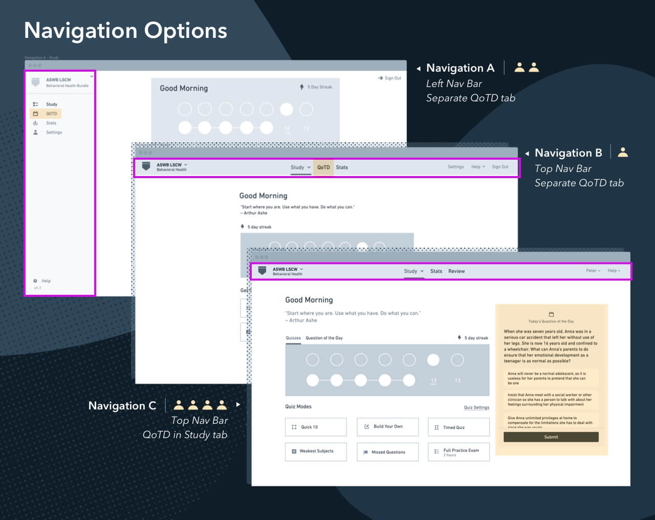
Our team had discussed moving the popular Question of the Day feature from its own separate tab to join the other five quiz modes we offer. Of the options we displayed, most users found the top navigation with the Question of the Day front and center (alongside other study modes) on the “home” study tab to be most clear. This user feedback validated a significant shift in our product’s navigation and information architecture.
Though considering user feedback is paramount to building a successful product, we needed to balance user preference with the team’s appetite and workload. After presenting user testing findings to the larger team, we determined we would pursue the Full Practice Exam and Review tab features but table the Notes feature; it would be a larger development lift than we were able to commit to for a V1 launch.
Armed with user test data that validated our layout, flow, and feature decisions, we moved on to visuals.
Visual Design
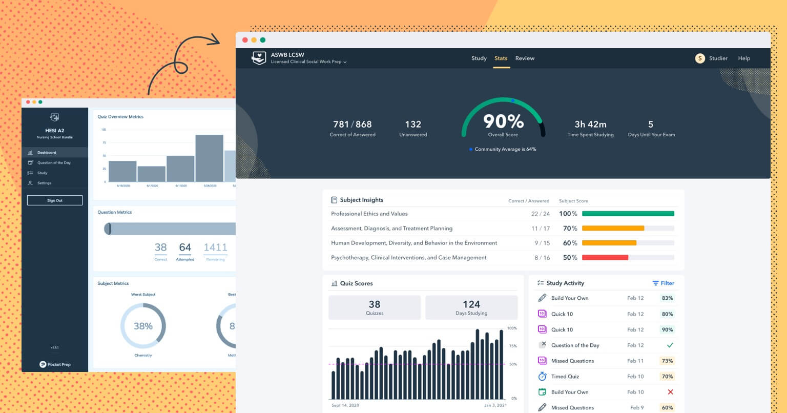
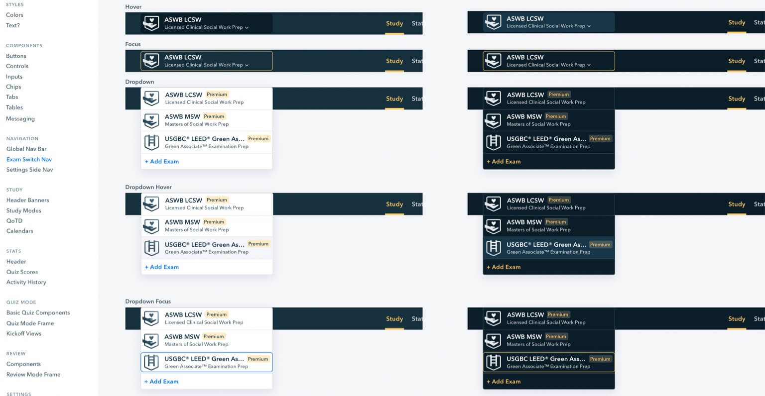
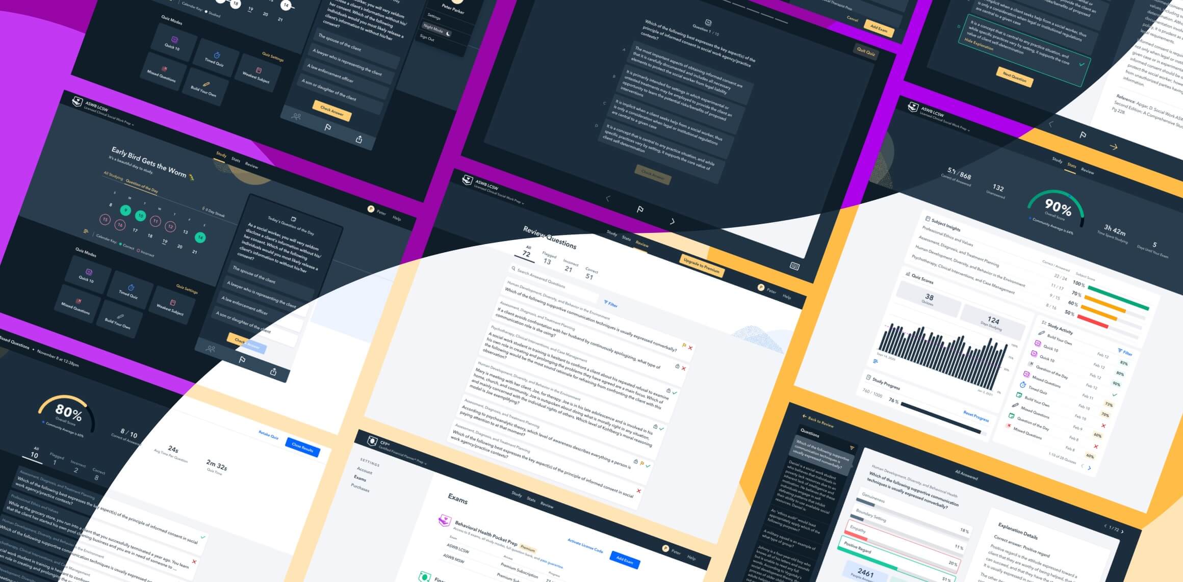
Our design team works in Sketch for our UI design. In developing the web platform’s visual designs, I needed to hold the existing mobile app’s UI in mind for continuity of components and brand feel while also optimizing for the screen real estate a desktop format afforded.
I also had to consider an upcoming product initiative to bring our mobile design to the level of our fresh web design; if I pushed the web app design too far, achieving parity with our mobile apps would be more difficult.
Our new pocketprep.com website had just launched. I took the web platform’s visual design stage as an opportunity to inject some brand delight and friendliness into the interface through colors and patterns from the website. I had a fresh visual language to play with.
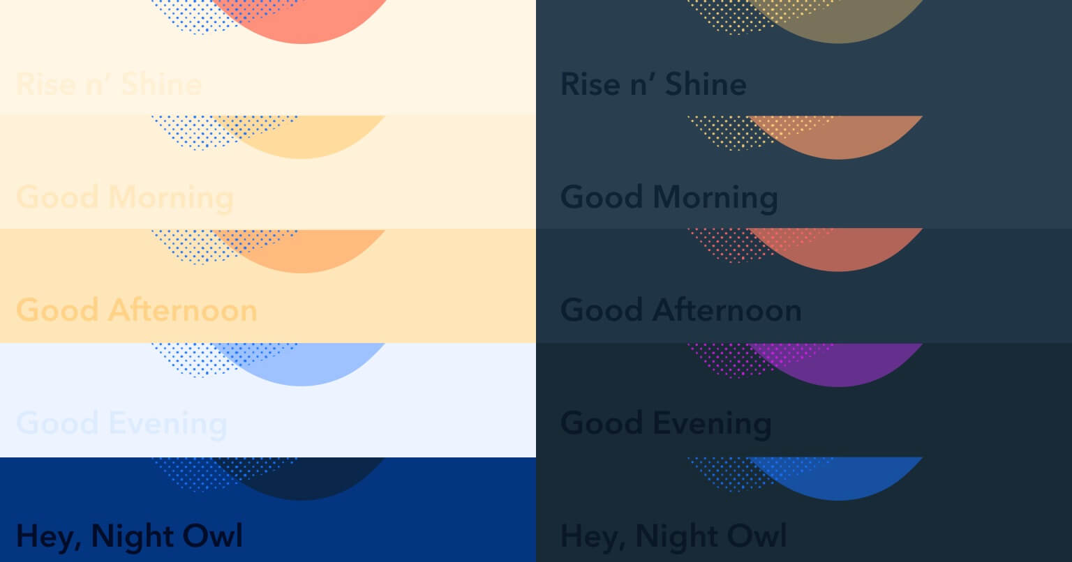
Survey feedback illustrated how many of our users log into our app and feel immense anxiety for their exam. I wanted to create an interface that felt safe, friendly, and encouraging. With this in mind, I introduced a home page banner that shifted in color throughout the day and greeted users with encouragement and humor.
While opportunities for playfulness were fun to explore, there were also practical visual functionalities to consider. Though our “web” product was ideally for desktop use, it also required design for full responsiveness across mobile, tablet, and desktop breakpoints.
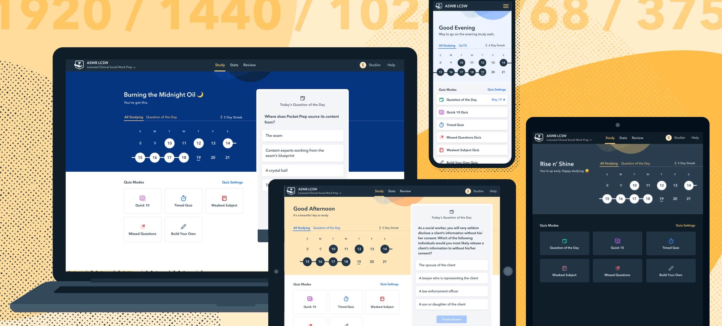
We incorporated dark mode as a moment of delight and a savvy way to acknowledge the studying preferences of our night owl users.
All of these elements were incorporated into vignettes to ensure our designs were as consistent as possible across web and mobile, from light/dark mode colors to individual UI components.
Hand-off and development
Upon hand-off of visual designs to our development team, the devs and I collaborated frequently to ensure designs were implemented correctly and improved when Colin and Robby saw problems.
Previously, Pocket Prep’s design and development were entirely built by agencies before our co-founders chose to build an internal team. The benefit of in-house UX and dev teams is deep and consistent collaboration to ensure implementation adheres to the design. A strong design doesn’t matter if dev and design don’t get the time to ensure implementation reflects it.
To maintain that accurate adherence, our UX and dev teams held eight one-hour independent VQA (Visual Quality Assurance) meetings to review implemented features and point out areas where designs didn’t match the dev environment. These meetings were a significant investment of time from both the design and dev sides but crucial to ensure the final product our users experienced matched the designs.
From a functionality standpoint, the benefit of two in-house devs who maintain our CMS and understand the structure of our data was crucial in solving edge cases that inevitably arose. It resulted in a higher standard of code for good maintenance and better performance.
Through design and dev challenges, we were able to work through issues thoroughly and collaboratively as a team.
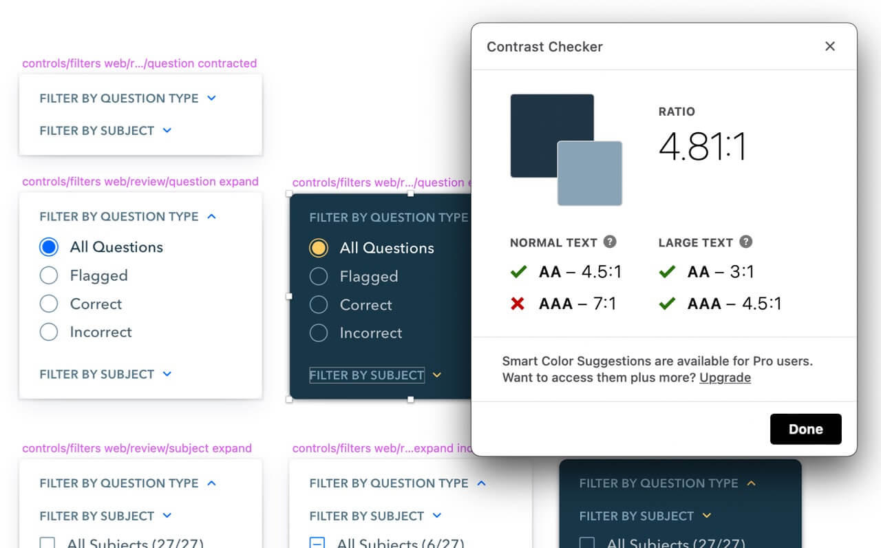
A note on Accessibility
When I first joined Pocket Prep I advocated for stronger Web Content Accessibility Guidelines (WCAG) adherence as a company. An accessible product would be a smart business decision and ethically the right thing to pursue. It’s a testament to our leadership and larger team that they immediately supported an accessibility initiative fully with their time and funding.
Pocket Prep partnered with Ablr, a digital accessibility company, to ensure our designs for web and mobile reached accessibility standards. We knew we had a lot of room to grow, and our product team as a whole felt that reaching WCAG compliance was an important element of Pocket Prep’s mission to make “Education accessible for all”.
I could write a separate post about accessibility work alone (as could our developers). For now, this is an ongoing initiative that our product team is actively working on across our web and mobile platforms. You can find our preliminary Accessibility Statement on our website.
A retrospective
This project ultimately took 8 months to design and 6 months to build.
We followed a rigorous design process driven by community feedback, user testing, and design systems thinking to not only build a strong product but to lay a foundation our design and development teams could build upon in future products.
Our launch was incredibly smooth – only a smattering of small bugs. We took the proper time needed to build a strong product.
Some things we did well:
- CEO, CTO, and dev teams were involved in goal setting, brainstorming, user flows, and information architecture discussions
- We held regular check-in’s for constructive feedback on designs so all parties were informed and had buy-in by the time I delivered final designs
- We took advantage of our new brand (fresh from the website redesign) and incorporated it subtly into our product for a cohesive visual language
- We gathered feedback from our users early and often
- We held a rigorous VQA process through implementation so the product was built with high fidelity to the designs
What we could have done better:
- I designed the whole product and delivered it in its entirety to development. They caught visual inconsistencies that required visual rework across the product. If I had delivered one section at a time (ie, onboarding, then the study tab), then I could have made adjustments by learning from each section’s handoff.
- We brought our marketing team into our design process mid-way, when we should have involved them as a key stakeholder from the Define & Align stage.
Closing & thanks
We are grateful for the generous feedback from our Pocket Prep users – over 650 of them provided thoughtful suggestions and insights into how they use our product day-to-day in order to study for their exams.
Thanks to all of our team members, each of whom contributed to a successful launch. Special shoutout to our product team:
- Two web devs: Colin Ulin and Robby Helms
- Product Designer: Bethany Faulkner (me)
- CTO: Ken Gillette advisor
- VP of Engineering: Rob Whitman advisor
- UX Lead: Heidi Baggerman advisor
Pocket Prep is excited to present our new web platform — and now mobile apps — to our users after over a year of work. We’re excited to hear back from our users and keep improving.
 learning science